That's all for this semester. Whew!
Saturday, August 7, 2010
Saturday, July 24, 2010
Week 10-Homeland Security
NORAD Buffers and Line of Sight Analysis
This week's lab was somewhat straight forward for me until Deliverables 3 and 4 came into the equation. Things seem to get a disjointed after creating the viewshed. It seemed that no matter where I placed my observation points, the entrance tunnel was visible...........even if I put the point 5 miles from the site. I redid this sequence a number of times and eventually came up with a sight line was at least partially obscured. Deliverable 4 took me over 10 hours to produce as I couldn't come up with anything that came close to a 3d rendering. I believe there was something with the orthoimage that wasn't allowing this. I went back to my last Week 9 drawing and re-exported the file again...........(I actually did around 6-8 combinations before this), and for some unknown reasoning I was able to come up a Deliverable 4 that was 3d ish. I wasn't able to manipulate it very well without significant distortion. Fortunately the copy and past of the sight line into the ArcScene went smooth, except it was a grey color and not green/red. This week took me about a whole day more than I planned but I felt more comfortable with buffers, label and the intersect tool and the exercise as shown seems like some good practical skills to have.
Wednesday, July 7, 2010
Week 8-Washington D.C. Crime
Analysis of Crime in Washington D.C. for August, 2009
Map Showing Crime for August 2009 in Proximity
to Police Stations
Map Showing the Density of Stolen Autos within D.C. and the Time of Day of the Theft
I enjoyed this week and appreciated the walk-through on how to do the analysis. Some of the difficulties I experienced were with the Geocoding exercise and manipulating the graphs. I never did get the graphs to display like I wanted and have no idea how to get all of the elements you want on your graph...........especially if it has names on the x axis. Overall the projected went smoothly as the instructions were stellar. An enjoyable experience after pure frustration on Week 7.
Thursday, July 1, 2010
Week 8-On your own-Boise, ID
Week 8-- Boise, Idaho--Weighted Analysis
This project was to show a basemap of Boise, Idaho, a distance analysis from the State Capital and the airport, then do a weighted analysis of the median home values and based on a certain age group. I started the with assembling the basemap for the area. There were a few minor projection and clipping problems, but overall I thought it went well. After the distance analysis, I tried for approximately three days to get sets of data that I could join together. The census tracts contained approximately 3700 tracts. The census tables contained only 50+/- records. I could see that I need to truncate or reclassify the 3700 tracts into the 50 records. I tried everything that I know how to do. So in the end I wasn't able to do the weighted analysis as I had a roadblock I couldn't pass. In retrospect, I should have chosen a Florida county where the data may have been cleaner.
Basically a real bummer of a week after a great start!
Boise, Idaho Basemap
Distances from the Idaho State Capital and Boise Airport
Wednesday, June 23, 2010
Week 6-Alachua County, FL
Location Decisions for Couple Relocating to Gainesville, FL Area
I found this exercise to be very educational in seeing the steps necessary to produce this analysis. The instructions were very clear and I had no difficulties in doing the tasks. The most challenging parts were putting the multiple data frames together for the maps, trying to develop meaningful legends (hard) and understanding the transition from classification to a value based system.
Comments on the Weighted Overlays:
The two weighted overlays show that there could be many factors that influence the outcome of a situation. In this particular example the couple has chosen to use 4 parameters for the analysis. The parameters being: proximity to the University and hospitals, demographics of the age of the population (showing the area with the most 40-49 year olds) and the median home values in the area. Two different outcomes were weighted for the analysis. Analysis 1 shows equal weighting, or 25% for each parameter. Analysis 2 shows the proximity to the University and hospitals comprising 80% of the analysis. Based on the analyses both show the same tracts as being the best place to live. These tracts are on the west side of the city. I believe that by having a thorough interview with the couple would help with the weighting. This would most likely skew the results. Other factors that may play into the analyses are travel times to the University and hospitals and the schedules that the couple may need to adhere to. So it could be that the Dr. may have higher priorites to be in proximity to a hospital than than the professor travelling to the University. The results may also change if the the couple has a lower budget for housing and would choose to obtain a property below the highest median value of the area.
Wednesday, June 16, 2010
Week 5-Urban Planning and Impact Assessment
ESRI-Urban Planning and Impact Assessment-Module 5 Exercises
This maps shows the occupancy percentage of University Students for Pewter City. Pewter City is a fictitious city developed by the Australia's Queensland State Government, Department of Natural Resources. 

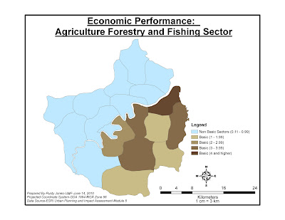
This map shows the Location Quotient (LQ) for the Peltrum Region (fictitious). This in order to understand what industries are driving the economy of a region. This maps shows the LQ for the Agriculture and Fishing Sectors within the Peltrum region and the basic and non-basic sectors.
These exercises where valuable for me in learning about creating queries, template and legend layouts, joins and spatial selections.
Sunday, June 13, 2010
Oil Animation Exercise
Deepwater Horizon Oil Spill Animation Sequence
Link below:
http://students.uwf.edu/rgj1/Oil%20Animation/RGJ-OilAnimation061310.avi
GIS Disaster Response in the Deepwater Horizon Oil Spill
The role of GIS in the Deepwater Horizon Oil Spill has played a crucial role. When a disaster such as this has occurred, time and information is urgently needed. Time is something that can't be changed but information can. This is where GIS has been a tremendous help. In the initial stages after the disaster occurred, the need for organization was great. Thad Allen of the U.S. Coast Guard was named as Incident Commander to develop this organization. It is assumed by this observer that the Incident Commander developed teams to respond to the disaster. One of teams of first responders is undoubtedly the GIS team. With maps being a universal way of communicating, the GIS team was tasked with creating maps portraying the size and projected movement of the oil spill. This type of information is critical to prepare for the disaster. Remote Sensing is a valuable tool that was used in conjunction with on the water teams to help give some scope to the size of the spill and growth. This information has been supplied to the appropriate agencies to develop a projected landfall track of the spill. This is necessary to the Incident Command and other government officials to make judgments on where to concentrate available resources.
GIS products have not been limited to maps, but graphs, tables and other written materials too. This information has allowed placement of booms and construction of barriers in efforts to prevent damage to the sensitive shoreline. In addition, this information has been a tool in planning with the mobilization of people and boats for skimming and beach clean-up operations.
In places where the damage has already occurred, the GIS team has played a key role by measuring the extent of the damage. This has helped land managers, property owners and government officials in dispatching available resources to try and mitigate further damage to beaches, wetlands, wildlife, fish and residents of the Gulf coast. This information is also vital in determining an actual cost of this disaster. This cost is rising until the time the oil well is capped and final damage assessments are determined.
As this brief narrative states GIS is a vital element in this oil spill disaster response. GIS will continue to be an important factor in monitoring the movement of the spill, damage assessment and also in the recovery process for years (unfortunately) to come.
Subscribe to:
Comments (Atom)


